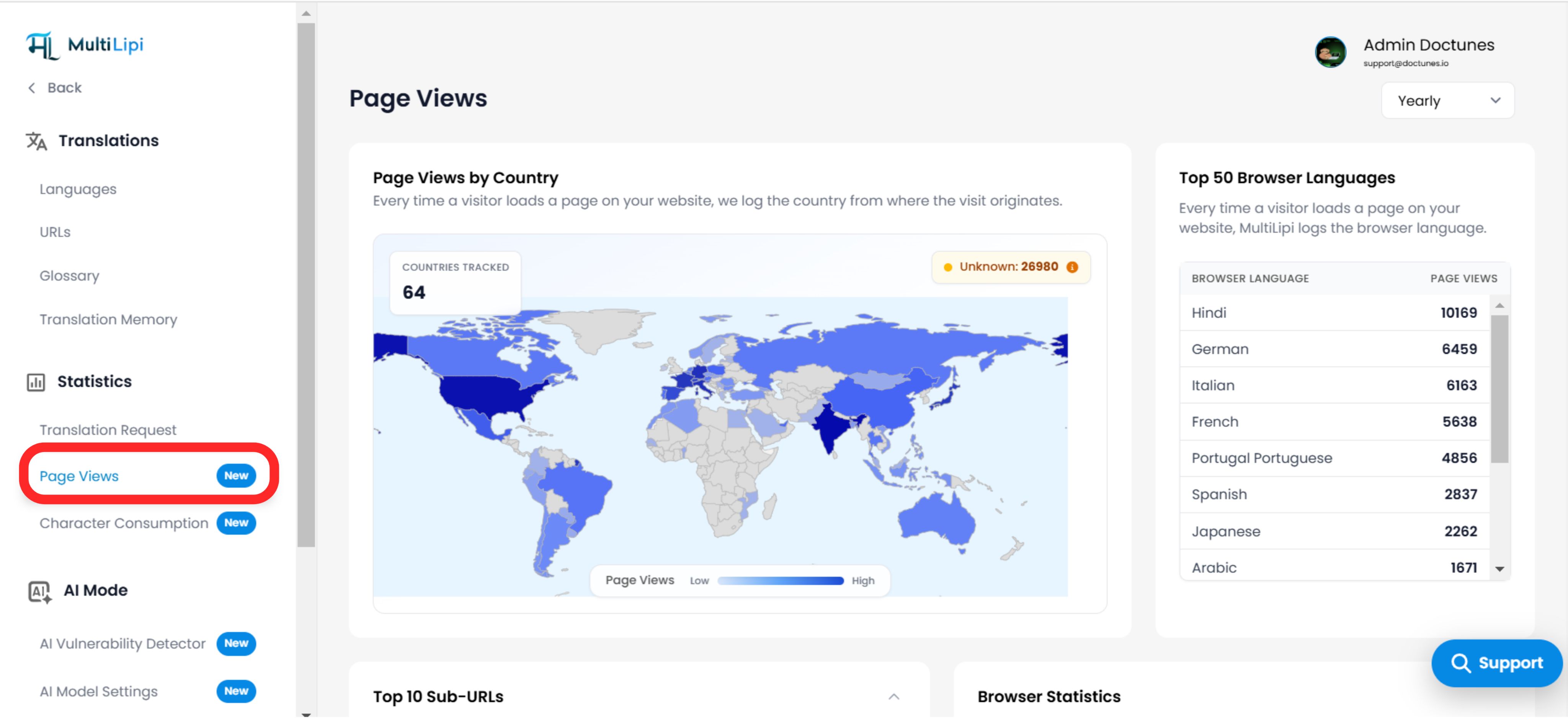
Translation is an investment; traffic is the return. The Visualizações de página dashboard is your central telemetry unit for understanding user behavior across your localized subdomains. Unlike generic analytics, this view is specifically architected to track multilingual interaction, helping you correlate specific languages with specific regions and devices.
This guide details the navigation protocol and the five core intelligence modules within this dashboard.
2. The Intelligence Modules
Breaking down the data signals.
A. Geospatial Intelligence (Page Views by Country)
Visualization: A color-coded choropleth map highlighting global density.
The Metrics:
Heatmap: Darker regions indicate higher traffic volume.
Unknown Badge: Top-right indicator for traffic where IP geolocation failed (e.g., VPNs or masked IPs).
Total Count: Top-left counter showing the number of active countries.
Strategic Value: Validates market penetration. If you enabled "French" targeting France but see a spike in "Canada," you might need to adjust your dialect strategy (fr-FR vs. fr-CA).

B. Linguistic Demographics (Top 50 Browser Languages)
Visualization: A ranked list of the detected Accept-Language headers from your visitors (e.g., Hindi, German, Italian).
Strategic Value: This is your Demand Indicator.
Cenário: You haven't translated your site into Japanese yet, but "Japanese" appears in your Top 10 browser languages.
Ação: This is a clear signal to enable Japanese immediately to capture this existing demand.
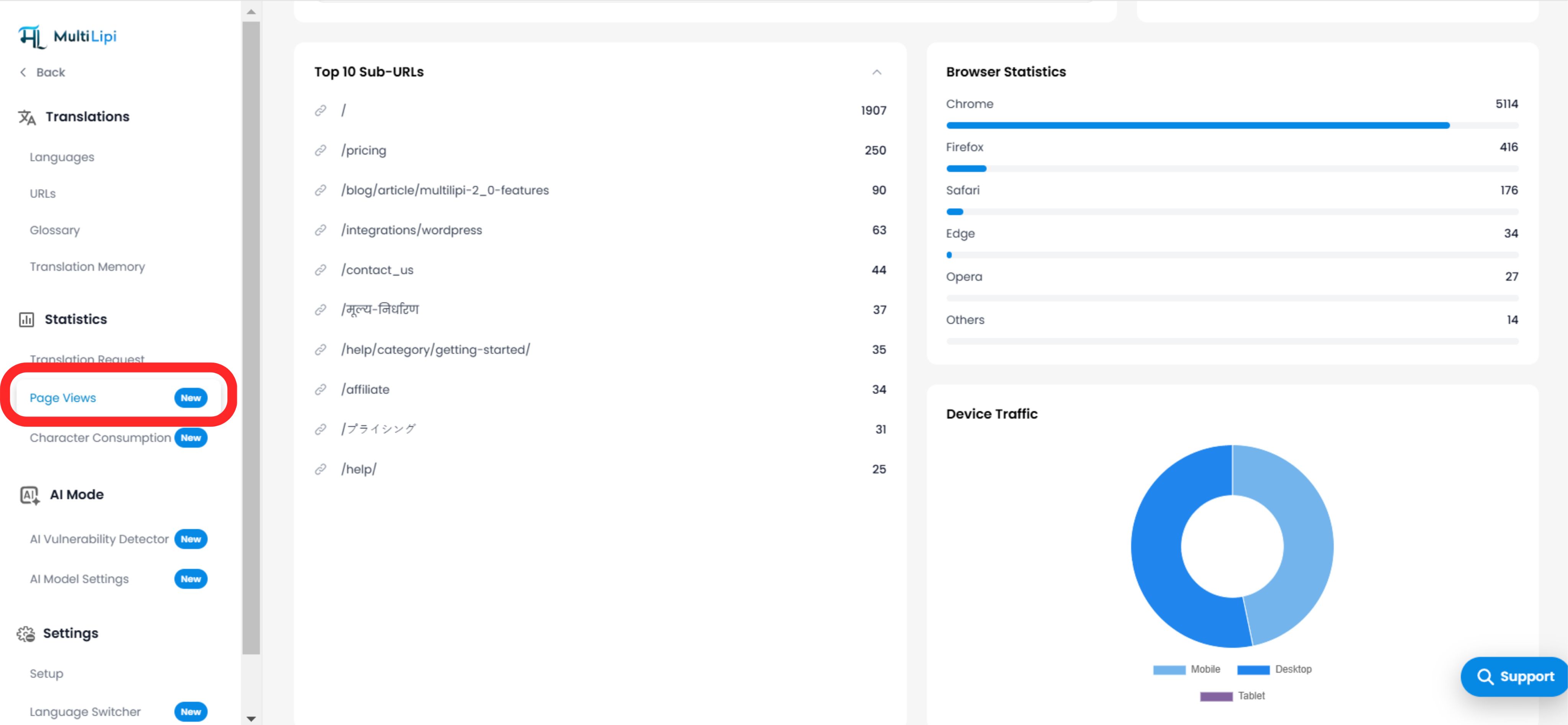
C. Content Velocity (Top 10 Sub-URLs)
Visualization: A leaderboard of your most accessed paths (e.g., /preços , /blog/features).
Strategic Value: Prioritization.
Perceção: If /preços is your #1 translated page, you should invest in Human Review for that specific URL to ensure conversion copy is perfect, while leaving lower-traffic blog posts to the AI.

D. User Agent Analytics (Browser & Device)
Browser Statistics: A bar graph breaking down client usage (Chrome, Safari, Edge, Firefox).
Use Case: Debugging. If "Safari" traffic has a 100% bounce rate, your language switcher might be broken on iOS.
Device Traffic: A donut chart splitting traffic between Desktop, Mobile, and Tablet.
Use Case: Optimization. If 80% of your Spanish traffic is "Mobile," ensure your Spanish text strings are short enough to fit on small screens without breaking the UI.
3. Temporal Granularity (Time Filters)
Zooming into the data.
Use the dropdown filter in the top-right corner to adjust the analysis window:
Yearly: Identify macro-trends and seasonality.
Monthly: Track month-over-month growth after a localization launch.
Weekly: Monitor the immediate impact of a marketing campaign.
4. Strategic Synthesis
How to act on this data.
The Optimization Loop:
Check Browser Languages: Identify an untranslated language with high demand.
Enable Language: Add it to your project.
Check Country Map: Verify traffic starts flowing from the relevant region.
Check Top URLs: See which pages these new users are visiting and refine the translations there first.
